Grid Size Display Indicator with a Gem: rails-bootstrap-sass-grid_size_display
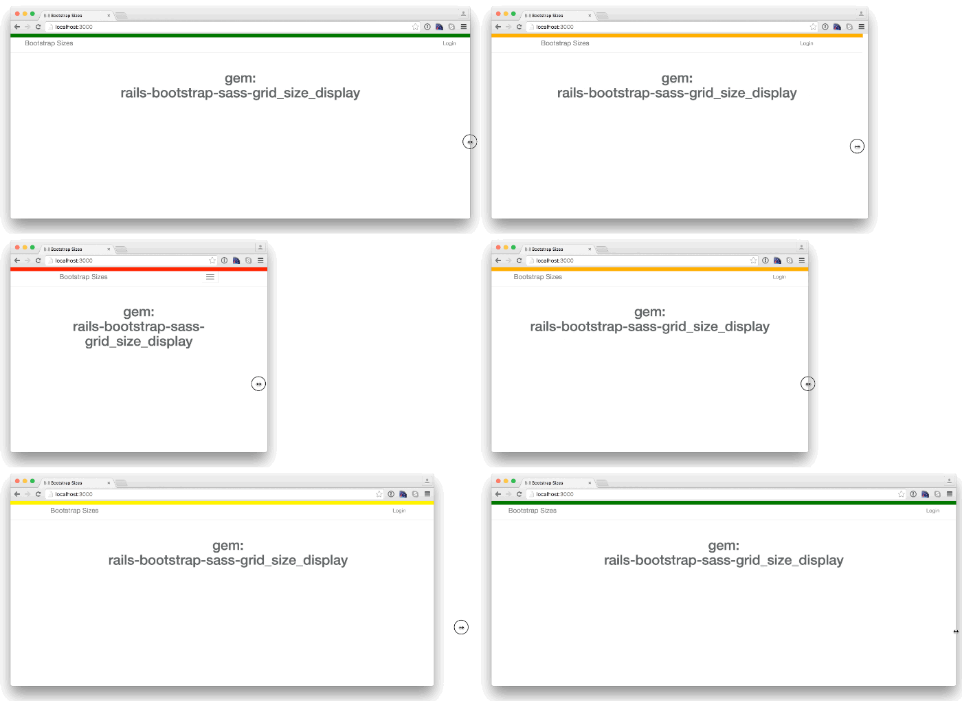
/Have you ever wondered if you're viewing a col-xs-* or a col-sm-* grid when using Bootstrap? If you're using Rails and the bootstrap-sass gem, take a look at this new gem I wrote: rails-bootstrap-sass-grid_size_display. It adds a bar at the top of the page that changes colors based on the grid breakpoints.
The gem uses the media queries defined in the Bootstrap documentation:
@media (max-width: @screen-xs-max) { ... }
@media (min-width: @screen-sm-min) and (max-width: @screen-sm-max) { ... }
@media (min-width: @screen-md-min) and (max-width: @screen-md-max) { ... }
@media (min-width: @screen-lg-min) { ... }
You can even control when to display the bar using query parameters.
Take a look at the documentation here:
https://github.com/jgdreyes/rails-bootstrap-sass-grid_size_display
I hope you enjoy!

